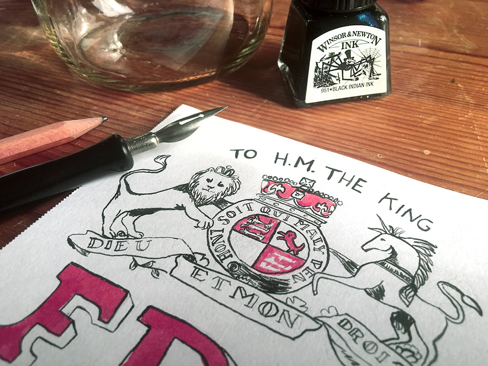
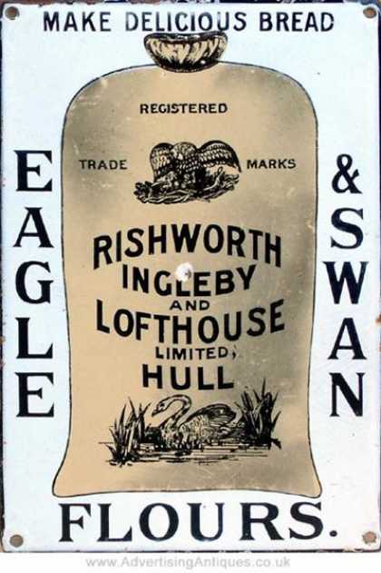
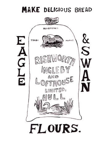
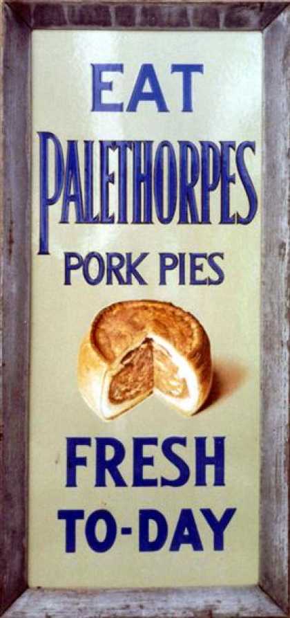
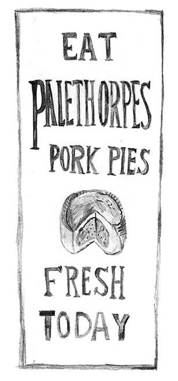
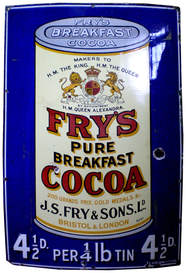
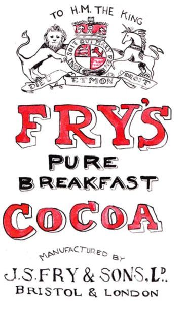
 Like most of us, for the longest time I've been downright in love with the products of yester-year. We all get a little misty eyed remembering vintage packaging and advertising, don't we? Seems like they strike a chord with all of us, one way or another. A lot of these old ads and products remind me of my great grandparents. I think about how different going down to the local shops would have been for them at my age, and nostalgia plays that familiar tune. Visiting them up in Warrington, in Cheshire in the UK was one of my all time favourite things when I was younger. Most of my youth was market stalls, hand painted signs, and old fashioned living. Last autumn I went on an amazing 'ghost sign' tour with my Dad around London, which had us bounding about London Bridge area in the pouring rain on an app-guided tour of fantastic fading signs on the sides of buildings. It was incredibly inspiring, and there's just something about that old way of advertising that has always captured my heart. The designs, the fonts, the imagery - yes, I get excited about fonts. Who doesn't?! All these things used to be created completely by hand, and it gave them a certain vibe that we're missing these days. I know, I know, I have my rose tinted glasses on for sure. But it's so easy to lean on digital tricks to perfect mistakes now, I actually kind of miss making them. Remember at school when you were on a trip to some museum or other and you had to sit in front of a relevant relic you were studying and draw it? Even back then, I wanted my art to be like looking at a photograph, it was that accurate! Alas, I didn't have that skill at 8 years old, and I still don't have it now. 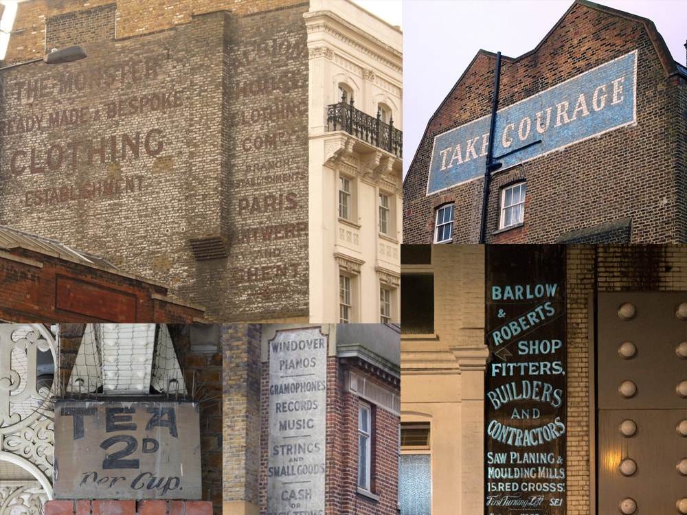 During that same visit back home I also went down to the Museum of Brands, Packaging and Advertising on the Lancaster Road - if I lived in London right now I would be at that place every damned day. I must have been there for a solid 3 or 4 hours just staring, sketching, and soaking in 100 years or more of brand design. If you haven't been there yet and you, like myself, are a vintage design fanatic, then you need to get yourself down there pronto - it is out of this world. Just a heads up though, bring your sketchbook because they do not allow photography. Which actually made for an even better experience, as it was a completely selfie-free zone... So with this new obsession rattling around in my brain since last year, I've started to take advantage of the down time I have on set to have a go at recreating some of my favourites. So far I've done most of them in inks of various colours, but I also enjoy the look of raw pencil on paper, and have drawn some in traditional lead. But the main theme in all of them is no digital corrections - no eraser, no exact measurements, and no worries.
There's something I really love about the look of a pencil sketch. This has been a great exercise for me in remembering that in art, not everything needs to be perfect. I get down on myself a lot of the time - like most artists I'm sure - about not getting it right. That internal critic will say "that's not what it looks like! Look at this mess! No one wants to see that!" and I'll lose all my confidence. In an effort to allow myself those mistakes and enjoy the work again, this collection has been purposefully imperfect. I mean, what's the point in recreating something exactly how it already is? I want my art to reflect me the way I am, and the way I create. And not some exact replica nonsense I beat myself up making.
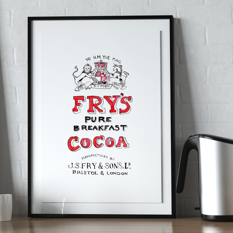
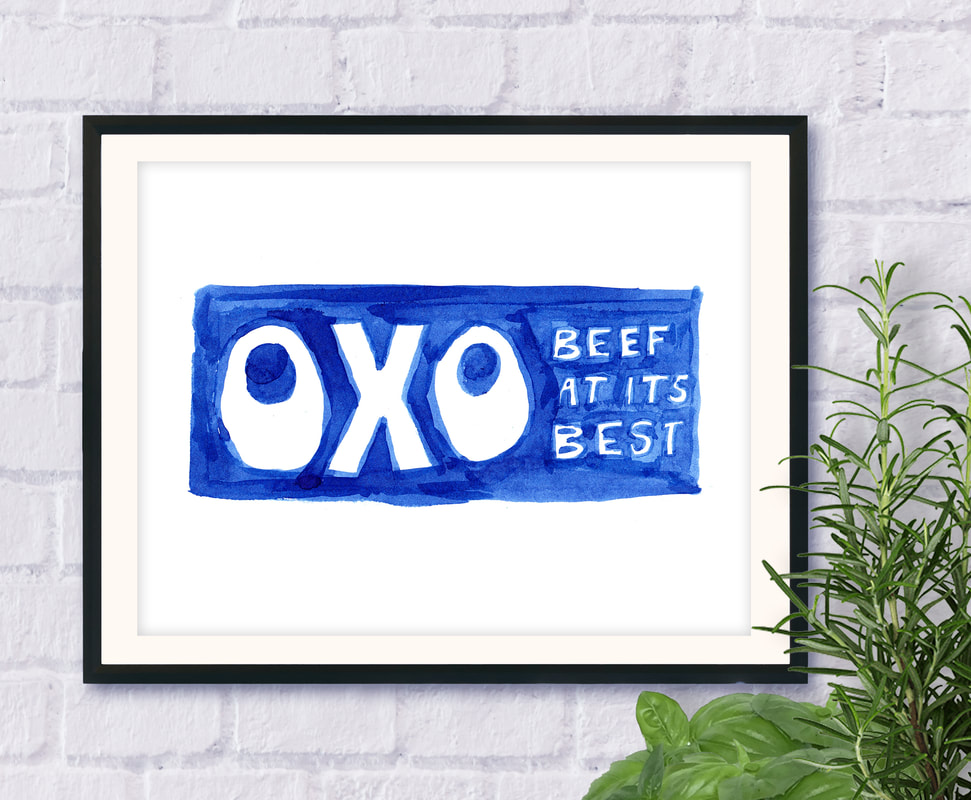 I just went out tonight to get some new coloured pencils, so I can really get back into less digital patterns of work. These pieces are really helping me connect to a part of history that I love, by dusting the cobwebs off the ol' paper pad and not letting myself use the excuse "what if it's not perfect?" Take that Ctrl + Z safety net away for a while, I want to remember what it's like to get lost in a project with a pencil in my hand! And what better subject matter than artwork created before Photoshop was even a twinkle in Adobe's eye... come to think of it, before photos of any kind... These are a few of the pieces I've created so far, which are also available as 8.5" x 11" prints. Keep an eye on my shop for more to come! If your kitchen is feeling a little too modern and you feel like bringing a touch of nostalgia to your mornings, grab a print or two to hang over the kettle. Make your great grandparents proud!
0 Comments
It's finally started! For so long I've been trying to convince myself to get moving on this project - One of my ambitions for my illustration and my writing has always been to combine the two in a way that feels right for me. A lot of people have said that I should write a children's book. Now I have TONS of experience working with kids of all ages, from my time at summer camps, and teaching at the art studio. But it just didn't quite feel like the right fit. Since working on the wonderful Kooper's Tale I have been batting some ideas around on that subject, but for now I'll keep those on the back burner - with dozens of other projects all waiting to boil over... What has taken my fancy, is really trying to go somewhere with my poetry. Thanks to the success of my poem 'All that had fallen' I became inspired to create a whole host of other creepy and slightly macabre poems and short stories, and put them together in an illustrated anthology. As I mentioned before on my old blog, I've taken a lot of inspiration from an absolutely brilliant illustrator called Emily Carroll, and a few other comic creators with a fantastic sense of style and storytelling. Now I've been working on this slowly here and there for a long time. I've got two or three comics already storyboarded out, and all the poetry ready to go. But me being me, I have this really nasty habit of questioning absolutely everything I do - to the point where it literally paralyzes any progress in a particular area, because I'm so scared of getting it wrong. It's a killer, to both my motivation as well as productivity. But enough is enough! I've messed about and skived off for way too long, and now that all I have is great ideas and time on my hands in between set days, I'm going for it! I'm one page down, with about 20 to go in this story alone....but forward is forward, and no matter how small the step, I'm inching that little bit closer to my goals one image at a time. What do you think? Now that I've finally settled on a look, I can't wait to get started on the rest. Come back soon and see if there's more!  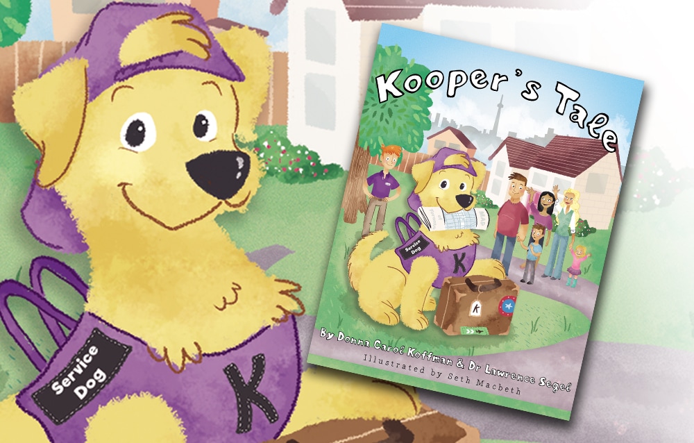 Click here to purchase your copy today! Very proud to announce that a new children’s book is now available, featuring my illustrations. Written by a lovely lady in Toronto, Donna Koffman shares the story of her autistic grandson and his best friend, with help from her co-author Dr. Lawrence Segel. Kooper’s tale gains its origins from the real life difficulties that face her grandson Reese, who has severe non-verbal autism. Not understanding the world as we do, Reese has no concept of the dangers that can await him when he runs off. All he wants is to run, play, and be free to explore. But busy roads, unseen hazards, and getting lost are all potential threats. What Reese needs is a friend who understands, and can help him in that very special way that only a highly trained professional knows how – and that’s where Kooper comes in. 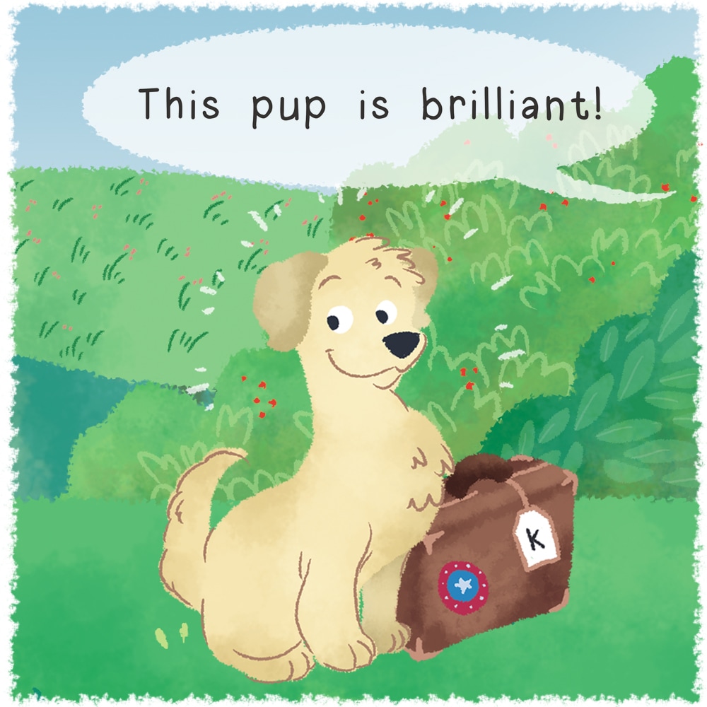 The story is told in a fun, engaging way, and teaches young children what Kooper’s role is as a service dog, and what that means for Reese and his family. With plenty of bright and colourful pictures to help tell the story, Donna and Dr. Segel hope to educate, inform, and warm hearts with their wonderful book. You can click here to get your copy of Kooper’s Tale, available at Amazon.ca. |
LATEST NEWS

[email protected]
Categories:
All
Press:Follow on Instagram:
|
 RSS Feed
